This is a small collection of design and graphic user interface usability observations, tips, tricks and how-to's, I've collected over three decades. It's random, unsystematic and by no means a replacement for such serious knowledge treasuries like
Ask Tog, Nielsen-Norman Group, UX matters and many others.
This part is always "under construction", always in the process of being enriched and updated.
Cartoons are courtesy Victor Bogorad
 Click on any topic on the left to read more.
| James Gibson wrote about the idea of affordance in 1979. He described affordances as action possibilities in the environment. In 1988 Don Norman modified the idea of affordances in his book The Design of Everyday Things. He referred to the idea of perceived affordances: if you want people to take action on an object, whether in real life or on a computer screen, you need to make sure that they can easily perceive, figure out, and interpret what the object is and what they can and should do with it. Think about affordance cues when you design. By giving people cues (mostly visual) about what they can do with a particular object, you make it more likely that they will take that action.
To maximize the perceived affordance of "clickability", color and underline the link text, make buttons look like buttons. Users shouldn't have to guess or scrub the page to find out where they can click. If an element is clickable, for example, it must appear that way, or a user may never try clicking it. In touch screens, where is no hover highlight affordance, this is even more important.
How new users understand what to do?
Four principles for screen interfaces:
|
 |
"Knowledge is knowing a tomato is a fruit.. Wisdom is not putting it in a fruit salad."
- Don't force user to memorize anything, especially things that have been completed (fields filled, items checked, choices made).
- Avoid abbreviations, acronyms, initialisms.
- Use "progress monitors". See also
- Make functions that are not used often to be self-explanatory. Don't bother with keyboard shortcuts for them. Nobody remembers them anyway.
 |
|
Use "+" and "-" button to see more:
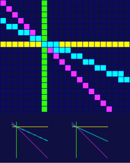
- Eye fixation - 230[70, 700] milliseconds
- Eye Movement - 30 milliseconds
- Perceptual Processor - 100[50, 200] milliseconds
- Cognitive Processor - 70[25, 170] milliseconds
- Motor Processor - 70[30, 100] milliseconds
- Press a key or button (K)
- Best typist = .08 seconds
- Good typist = .12 seconds
- Average skilled typist = .20 seconds
- Average non-secretary = .28 seconds
- Typing random letters = .50 seconds
- Typing complex codes = .75 seconds
- Worst typist = 1.2 seconds
- Point with a mouse (excluding click) (P) = 1.1 seconds
- Move hands to keyboard from mouse (or vice-versa) = .4 seconds
- Mentally prepare (M) = 1.35 seconds
- Wait for a computer to respond to input (R) - vary
While its hard to predict R, it's clear that the goal is to reduce "P" and "M". "P" time will increase exponentially, if the number of active (clickable) elements exceeds 8-12 (the approx. number of things one can grasp simultaneously). Alas, "M" time is the true test of how intuitive your UI is.
How to reduce M or predictive behavior of next.
Try to define all possible next actions in order of probability. A mental model of a task is typically streamlined and focused on the fundamental components of the task. Although there may be myriad optional details associated with a given task, the basic components should not have to compete with the details for the users attention. This is your Main Task, it defines the next move. I call this "next defines now" rule.Developed by Herbert Simon in late 40-ies, the Bounded Rationality is the idea that in decision-making, rationality of individuals is limited by (1) the information they have, (2) the cognitive limitations of their minds, and (3) the finite amount of time they have to make a decision. While we can do little to change (1) and (3), we can take (2 - the cognitive biases) into consideration. Cognitive biases are glitches in our thinking that cause us to make questionable decisions and reach erroneous conclusions.
| Confirmation Bias: we love to agree with people who agree with us. Its an unconscious act of referencing only those perspectives that fuel our preexisting views. Be reasonably conservative; follow the most established examples. |  |
| In-group Bias: a manifestation of our innate tribalistic tendencies. Appeal to a group of users, criticize competitor's ways and practices. | |
| Gambler's Fallacy: if it worked ones, it'd most likely work again. Imagine if it worked twice... Don't expect your customers to easily fall for something they didn't do before. Hot hand luck. Your outsider position may be a plus. | |
| Post-Purchase Rationalization or Buyer's Stockholm Syndrome: users, who bought into less than perfect solution, will do anything to rationalize using it. |
Observational Selection Bias: noticing things we didn't notice that much before, because we bought into those things.
Status-Quo Bias: we like to stick to our routines. If it ain't broke, don't fix it. Negativity Bias. Dwelling on negativity at the expense of genuinely good news. Don't expect users to notice many improvements over remaining flaws.
Bandwagon Effect: if you get at least few of the stakeholders to accept it, chances are you're golden.
Projection Bias: we tend to assume that most people think just like us. Well, they don't. That's why you are not an ideal persona to test for. We assume we're the most normal and typical. False consensus. Using "we", "users in general", etc., when there is no calling for it.
The Current Moment Bias: in general, we prefer healthy food, but now we want chocolate.
Anchoring Effect: we notice the difference in value, but not the value itself. How many times have you heard "this solution is better (faster, more intuitive, easier to learn, looks better, etc.) rather than "do we even need this"? The research found that ignoring part of the information (with a decision), rather than weighing all the options, can actually lead to more accurate decisions.
Apophenia: the experience of seeing patterns or connections in random or meaningless data.
When designing or re-designing the UI, always consider ALL aspects of the heuristic evaluation.
Despite of the physical world origin, buttons have survived the general victory over skeuomorphism. They are still there, maybe less physical in appearance. Their design and placement should take into consideration its nature. For example:
Call-to-action (CTA) buttons. The main point is that CTA buttons most often invoke server actions. Some of the actions can cause an irreversible action. Then a prompt "Are you sure.." is in order. Default or affirmative button (normally "OK", "Submit" etc.) should stand out.
Toggle buttons don't work well in groups (i.e. toolbars).
Positioning
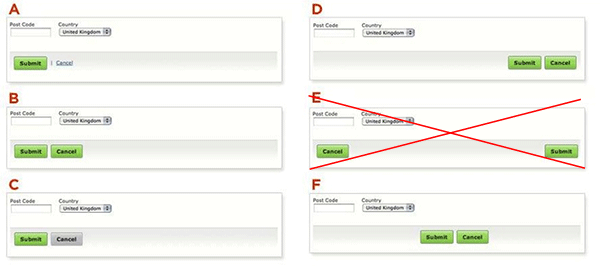
In a Form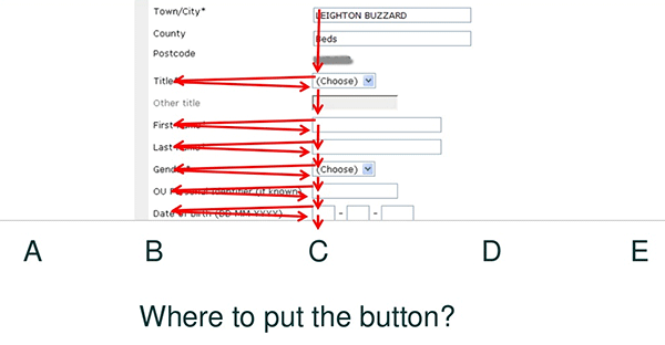
The obvious answer is "C". "D" and "E" is the second place user would look for a button. "A" and "B" is the last. Study shows that all versions work except for "E".
Spelling out the action. Very often a simple "OK" is not enough. Keep with one of the Jacob Nielsen's top heuristic principles: the user should not have to remember information from one part to another. Label buttons with what they do.
Practically, no matter what your product is designed to do, it's been done before. The goal is to do it better, i.e. faster, more accurate, more intuitive. If you can clearly demonstrate it, users will flock to your tray.
- The more mundane the product, the more creative you ought to be.
- Next defines now. User shouldn't be spending time thinking what to do next.
- Judge by what people in the middle say. People on the top have too much to protect.
- "If I had asked people what they wanted, they would have said faster horses" Henry Ford.
- Avoid questions that contain "how often" and other things people tend to lie about.
- Avoid binary questions.
- Cherish lead users and early adopters. They may have the most valuable information.
- Build personas, not straw men.
- Functional fixation. People tend to stick to the first idea that comes to mind and stick with it to its detriment.
- Keep it absolute foolproof. User should never be allowed to proceed with an error.
- Match the expectations. What user expect to happen when he interacts with the interface is exactly what should happen.
|
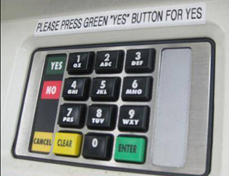
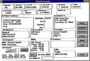
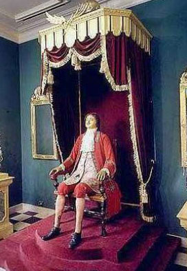
Believe it or not, this UI was used to dispatch ambulances once. How many lives were lost just because of it? It's a radical example. Most of the time bad UX just wastes a lot of users' time. Multiply on number of users and you'll end up with many lifetimes wasted. |
Blue Myth
Only two percent of all retinal cones are blue-sensitive cones and the eye brings blue into focus in front of rather than on the retina, visual acuity for the blue range of the spectrum is poor and it decreases with age. User performance in symbol identification is poorer with blue symbols than with symbols of any other color.
Where to use color-coding:
- tables
- lists
- adjacent elements
- labels
- badges
Colors and words have a lot in common. We all learn how to use words at an early age but unfortunately, few learn how to use color effectively. Unless you spend many hours mixing paints and trying out their various effects and nuances, speaking with colors can be like talking in a foreign language.
Most people don't learn the second language. In their color preferences, few ever go beyond primary colors. The following is based on US survey, made by artists Komar and Melamid in 1995.
| 1st favorite color | 2nd favorite color | ||
| Blue Green Red Black Purple/Violet Brown Pink/rose Beige/Tan White Grey Yellow Mauve Fuchsia Maroon |
44% 12% 11% 4% 4% 3% 3% 2% 2% 2% 2% 2% 2% 2% |
Blue Green Red Black Purple/Violet Brown Pink/rose Beige/Tan White Grey Yellow Mauve |
19% 17% 16% 7% 5% 4% 6% 3% 4% 3% 3% 2% |
Colors only work in combinations.
Inside (smaller) squares have the same color |
"A" and "B" squares are exactly the same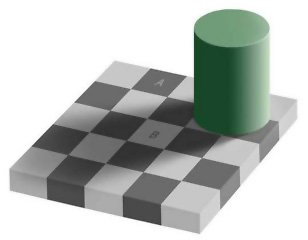 |
Our mood plays very important role too. Walk in a garden and look around you. Nature doesn't make mistakes with color. No matter how vivid or subtle, they always seem to work together. Why? Because the garden is pleasant..
Komar and Melamed didn't stop with colors. They have sent a long list of questions around the world, then "painted by numbers" the result.
 |
 |
| USA Most Liked | USA Least Liked |
Here are some of the questions:
| Do you prefer seeing bold, stark designs or more playful, whimsical designs? | bold, stark: 39% | playful, whimsical 49% | |
| Do you tend to favor paintings with sharp angles or ones with soft curves? | sharp angles 22% | soft curves 66% | |
| Which patterns do you like better: geometric patterns or more random uneven patterns? | geometric 30% | random 62% | |
| Do you like to see colors blend into each other or do you like it when different colors are kept apart? | blended 68% | separate 18% | |
| In general, which would you say that you prefer? When the artist uses more vibrant shades, paler shades, or darker shades of color? | vibrant 36% | paler 32% | darker 22% |
"Things should be made as simple as possible, but not any simpler." - Albert Einstein
When adding new features, keep in mind that 80% of users use only 20% of software features.
- Either eliminate unnecessary and exotic features
- Or activate them on user demand (settings)
- Hide Complexity (see Progressive disclosure)
- Minimize Visual Noise
- Reduce, Reuse, Recycle
- Avoid blank states
 |
"If you don't know the way, be guided by principles." |
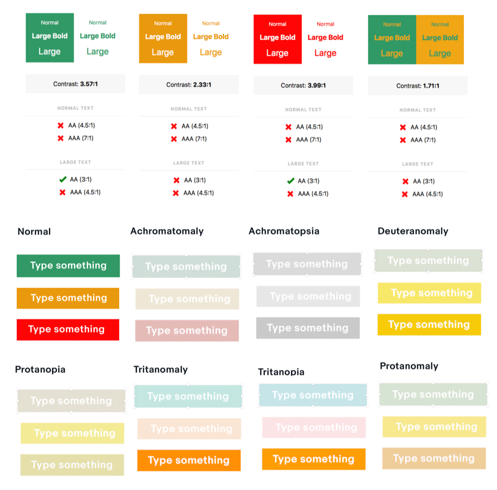
People have disabilities. You have to be aware of them. In the case of the UI design, it's mostly visual disabilities: contrast and color blindness. There are other things like support for the tabbed navigation, alt text for every image, etc.
Hopefully, today some UI design apps like Sketch have tools for that, so you can check you text contrast and see how people with different types of color blindness will see your stuff.
From ADA Compliance Rules
- Every image, video file, audio file, plug-in, etc. has an alt tag
- Complex graphics are accompanied by detailed text descriptions
- The alt descriptions describe the purpose of the objects
- If an image is also used as a link, make sure the alt tag describes the graphic and the link destination
- Decorative graphics with no other function have empty alt descriptions (alt= )
- Add captions to videos
- Add audio descriptions
- Create text transcript
- Create a link to the video rather than embedding it into web pages
- Add a link to the media player download
- Add an additional link to the text transcript
- The page should provide alternative links to the Image Map
- The
areatags must contain an alt attribute - Data tables have the column and row headers appropriately identified (using the
thtag) - Tables used strictly for layout purposes do NOT have header rows or columns
- Table cells are associated with the appropriate headers (e.g. with the id, headers, scope and/or axis HTML attributes)
- Make sure the page does not contain repeatedly flashing images
- Check to make sure the page does not contain a strobe effect
- A link is provided to a disability-accessible page where the plug-in can be downloaded
- All JS scripts and plug-ins (including Acrobat PDF files and PowerPoint files, etc.) and the content within them are accessible to assistive technologies, or else an alternative means of accessing equivalent content is provided
- When form controls are text input fields use the LABEL element
- When text is not available use the title attribute
- Include any special instructions within field labels
- Make sure that form fields are in a logical tab order
- Include a Skip Navigation button to help those using text readers
- Confirmation can't be provided right away from the remote server. For example,
sendmail. - Some ubiquitous actions like saving to local disk (command-S);
- Most of the non destructive actions. For example, closing saved files, windows, tabs, resize, move, etc.
- Supply actions with the confirmation message, such as "Your changes have been submitted" etc.
- Impact of the action should be immediately visible
- In certain touch screen situations, use click sound on buttons
- Update status info in:
- status line
- corresponding table cell
- dedicated window
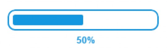
Response Times and how to use them in Progress Indicators (loaders, installers)
0.1 - 1 second is about the limit for having the user feel that the system is reacting instantaneously, meaning that no special feedback is necessary except to display the result. No progress indicator is needed.

|
1 - 3 second is about the limit for the user's flow of thought to stay uninterrupted, even though the user will notice the delay. Normally, no special feedback is necessary during delays of more than 0.1 but less than 1.0 second, but the user does lose the feeling of operating directly on the data. So, having a spinning wheel is recommended. |
|
3- 10/12 seconds is about the limit for keeping the user's attention focused on the dialogue. For longer delays, users will want to perform other tasks while waiting for the computer to finish, so they should be given feedback indicating when the computer expects to be done. Feedback during the delay is especially important if the response time is likely to be highly variable, since users will then not know what to expect. For all cases over 1.0 sec. a real progress indicator (bar) is recommended. Progress bar shows either %% of in the form of "XX of XXX is loaded (installed, etc.)" |
[Miller 1968; Card et al. 1991]
When waiting time exceeds it, it's a good practice to provide user with notification like: "Your request (application, inquiry, etc.) is in the process (scheduled, etc.). You will be notified (receive an email) when it's ready."
"To establish yourself in the world a person must do all they can to appear already established." - La Rochefoucauld
We're creatures of conventions (see the bit about the Behavioral Psych). In UI design they are our most powerful allies, saving us from the necessity to explain everything. It's not only that whatever you do, it's likely been done many times before. It's also a good chance your users did that too.
For example:
- Text links have to be colored. There is no need to say "click here", if the link is obvious.
- Use
"Move"if user knows where to move. Otherwise, use"Cut"or"Copy/Paste". - Don't use
"Cut"to delete stuff. Use explicit"Delete"command. - Emphasize the highest priority tasks through position, color, size.
- Things that are close together on the screen are seen as related. Avoid "I didn't notice this button because the action is simply too far removed from the objects it applies to."
Use when you wish to present information that the user needs to copy (and later paste into another application). Designate data to be copied in different font. Use block tag.
Separate structure and skin Define repeating visual features (like background and border styles) as separate skins that you can mix-and-match with your various objects to achieve a large amount of visual variety without much code. See the module object and its skins. Separating structure and skin can also mean using classes to name your objects and their components, rather than relying solely on the semantics of HTML. For example, the media object is named with class="media", and its components are named with class="img"(for the image/video component) and class="bd" (for the body/text component). By referencing these classes in your stylesheets (say, rather than directly styling the
Always start your projects with HTML5 boilerplate CSS.
Normalize.cssis a customizable CSS file that makes browsers render all elements more consistently and in line with modern standards.
Since it's nearly impossible to satisfy all your users with the same set of features (be it visual style, default settings or else), it's good to have some UI customization available. The more different tasks (user journeys) your app offers, the more is the need for that.
It's largely depends of the degree of freedom of action. Where are you between 100% pre-determined process (say, TurboTax) and 100% free fall (for example, 3d or paint app)?
Sometime (especially for web apps) you can provide automatic role-based customization based on the user login.
Some users like to re-organize things in the UI:
- Menus
- Colors
- Relative positions
Common in the desktop applications (browsers don't support docking), dockable panels allow user to arrange items on the screen to his liking and for maximum screen real estate utilization. Unlike collapsible panels, docking doesn't remove panels from the view.
| Docking Control | Less frequently used panels can be minimized and docked to the side |
 |
 |
What to dock/undock:
- Menus, menu bars
- Windows
- Toolboxes
What to display:
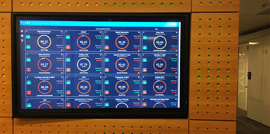
- Are there conditions of which we need to alert a user?
- Where should we place the data?
- What are the critical must-see or must-do items (KPIs)?
- Would users want to drill down to more detail?
- Are there conditions of which we need to alert a user?
- What is a particular users main reason for visiting the dashboard?
- What triggers a users visiting the dashboard?
- How frequently would a user visit the dashboard?
- What is a user trying to assess?
- What critical decisions does a user have to make?
- What is the likely flow of a users focus?
- Would a user want to compare some data with other data?
- What kinds of interactions do we need to support?
- Would users want to drill down to more detail?
- Where should we place the data?
- Is there a logical grouping scheme? Should we split data across tabs?
- Would users prefer conceptual or verbal information?
- How should we represent the data? What's appropriate visualization?
- Let user switch between chart and grid views
- Allow selective collapse dashboard panes
- Use drill-down charts.
- Don't overwhelm dashboard with details. Dashboard IS NOT a replacement for the rest of the app features.
- Timers
- Touch screens if possible
- Remote controls if applicable
- Speed up the interaction by freeing users from having to specify a value if the default is acceptable.
- Teach, by example, the type of answer that is appropriate for the question.
- Direct novice users toward a safe or common outcome, by letting them accept the default if they don't know what else to do.
- When possible (and why shouldn't it be), allow user to customize the default settings.
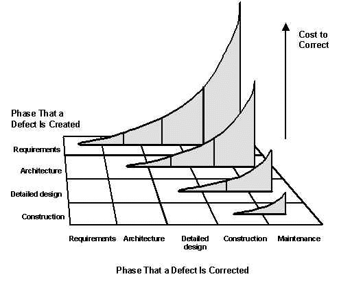
Good design is innovative. The possibilities for innovation are not, by any means, exhausted. Technological development is always offering new opportunities for innovative design. But innovative design always develops in tandem with innovative technology, and can never be an end in itself.
Good design makes a product useful. A product is bought to be used. It has to satisfy certain criteria, not only functional, but also psychological and aesthetic. Good design emphasises the usefulness of a product whilst disregarding anything that could possibly detract from it.
Good design is aesthetic. The aesthetic quality of a product is integral to its usefulness because products we use every day affect our person and our well-being. But only well-executed objects can be beautiful.
Good design makes a product understandable. It clarifies the products structure. Better still, it can make the product talk. At best, it is self-explanatory.
Good design is unobtrusive. Products fulfilling a purpose are like tools. They are neither decorative objects nor works of art. Their design should therefore be both neutral and restrained, to leave room for the users self-expression.
Good design is honest. It does not make a product more innovative, powerful or valuable than it really is. It does not attempt to manipulate the consumer with promises that cannot be kept.
Good design is long-lasting. It avoids being fashionable and therefore never appears antiquated. Unlike fashionable design, it lasts many years even in todays throwaway society.
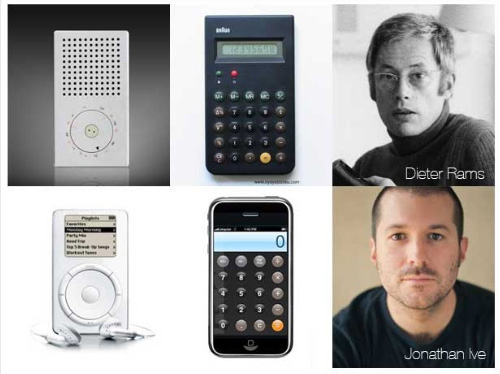
Good design is thorough, down to the last detail. Nothing must be arbitrary or left to chance. Care and accuracy in the design process show respect towards the consumer.
Good design is environmentally-friendly. Design makes an important contribution to the preservation of the environment. It conserves resources and minimises physical and visual pollution throughout the lifecycle of the product.
Good design is as little design as possible. Less, but better because it concentrates on the essential aspects, and the products are not burdened with non-essentials. Back to purity, back to simplicity.
There are many types of collapsible gadget. They are great space savers, but be careful: the expand/collapse navigation has to be 100% clear. If in doubt that users click/tap on the header, add suggesting icons.
Keep in mind:
- Since accordion panels are mutually exclusive, they are better, when only one panel at a time can be seen, i.e. mobile screens;
- "Expand all", "Collapse all" functions are good to have, but be reasonable when expanding all panels, if there are too many;
- There are still debates about using arrows vs. plus/minus icons. I think arrows are winning.
Explicit:
- Select item to move
- Select "move"
- Select move to from the opened directory
- Click to act
- Ability of user to do more complex visual manipulation. UI technology support.
- User environment. For example, user wears gloves that don't allow him to do a complex motion.
- Convention and cultural differences. Users may not be familiar with implied action.
 |
|
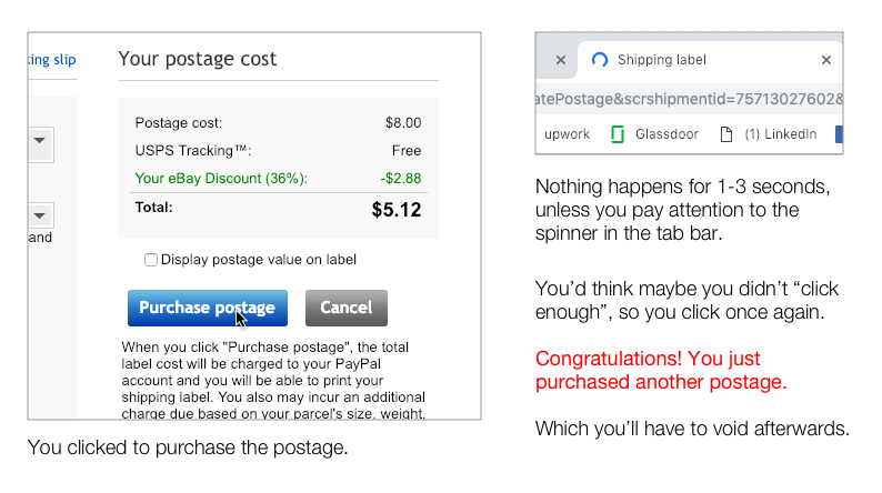
Here is an example of a jarring feedback neglect that affects thousands of people daily:
Filtering is necessary to avoid data clutter, server polling and overwhelming user. There are 3 stages of filtering the displayed data.
- App default state. You've already decided what to show to the user by default.
- Filters applied before sending the query and getting the result from the server. Back-end.
- Filtering provided info. Front-end only.
When designing filters, consider:
- Your filters' value-selection paradigmeither drill-down or parallel selection.
- Obvious and consistent way to undo filter selection.
- All filters easily available.
- At every step in the search workflow, display only filter values that correspond to the available items, or inventory.
- Provide filter values that encompass all items, or the complete inventory.
- Use relevance in %%.
- Display only filter values that apply to the available inventory.
Typical data grid (table) filtering:
- A separate panel for full table filtering
- Column filters
- Custom rows filter
- Range filter (from... to...)
- Quick filter (alphanumerical, ascendant/descendant, etc.
- Keyword and multi-keyword filters
Display only filter values that apply to the available inventory.
This is unfortunate, especially because there is an industry standard for it - BPMN (business process management notation). And it's more than just a library of logic elements: icons, objects, connectors, gates, etc. It supports a fully grown industry of Business Process Management applications. If you and your colleagues master it, it'll become a huge time-saver and headache killer.
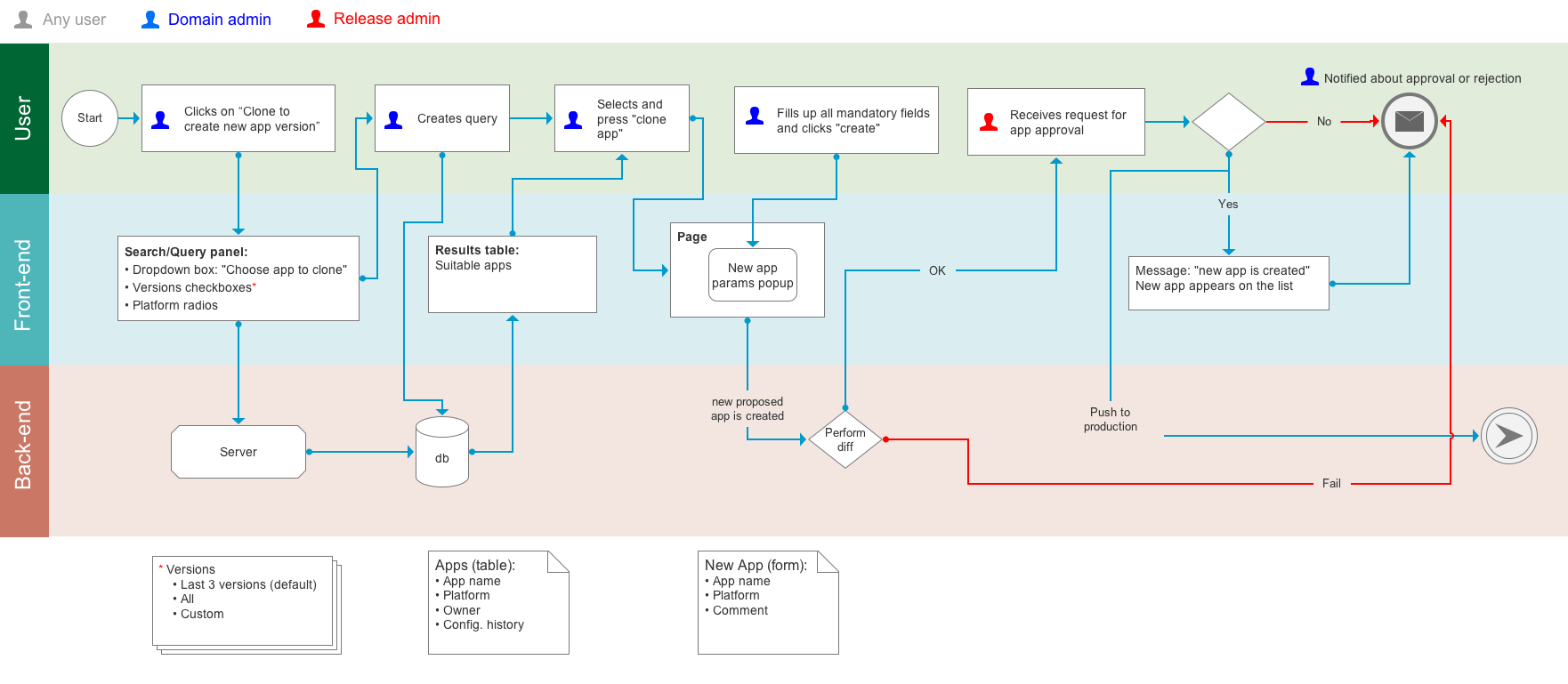
- Define swimlines. For any web app, it's user(s), front-end, back-end.
- Make sure the app you're using to create it has entire library of BPMN symbols. I had to create one for Axure myself.
- Using correct components will save you troubles designating different things like pages, gates, users, DBs, etc.
- Try to use apps that allow online commenting. See prototypers section.
If you don't want to collect ANY errors, irrelevant or malformed data, use 100% multiple choice forms, where user can only select from the list, radios or checkboxes.
Single Page Form or Wizard
Wizards are good in the following scenarios:
- Presenting a fixed workflow in a prescribed sequence. This can be particularly beneficial if you need to verify or validate prerequisite conditions before asking a user to commit to a lot of data input.
- Breaking up a long or complex workflow into manageable tasks.
- Wizards are effective in reducing the seeming complexity of a task or providing a sense of progressfor example, when filling in a tax form or performing a large number of setups during an initial system configuration. Where later information is contingent upon what data a user has already provided.
Single Page Forms are good in the following scenarios:
- Presenting a comprehensive list of all information a user must provide, letting users gather whatever information they lack before starting a task. A wizard that asks for information on the very last screen that sends a user off on a scavenger hunt can be an awkward and frustrating user experience. It can also add to code complexity by requiring the system to track incomplete states.
- Making it easy to navigate among data-entry fields by pressing Tab key. Power users can provide information efficiently and navigate to fields of interest without removing their fingers from the home position on their keyboard. This can be a significant consideration if users fill in a given form many times during the day.
- Reducing the number of hits on a server.
There are plenty of sources for good form templates like this.
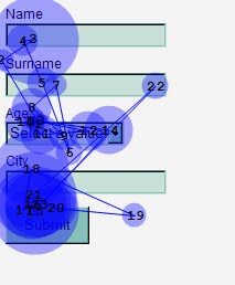
Some eye tracking experiments were performed to determine the best label/data alignment, position and emphasis.
| Test A: Left-Aligned Labels to the Left of Input Fields | Test B: Right-Aligned Labels to the Left of Input Fields |
 |
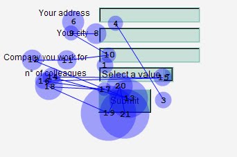 |
| Test C: Left-Aligned Labels Above Input Fields | Test D: Bold Labels Above Input Fields |
 |
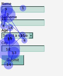 |
The winners are B & D. Still most of the time labels are placed on the left, because it conserve the vertical space.
To conserve horizontal space, people often use multi-column forms. This adds nothing to data legibility or speed.
- Use to help ambiguity-issues, when an item can be entered in multiple ways
- Use when the type of information entered can readily be matched with a specific piece of information in the system.
- Use when autocomplete suggestions can be pulled from a set of data that is manageable in size.
- Use when input speed is an important goal
- Use when input accuracy is an important goal
- Use when the number of items would be too large or inconvenient to display in a standard drop down box.
- Do not use if you want to provide the user an overview of all options available.
- The design should always keep users informed about what is going on, through appropriate feedback within a reasonable amount of time.
- The design should speak the users' language. Use words, phrases, and concepts familiar to the user, rather than internal jargon. Follow real-world conventions, making information appear in a natural and logical order.
- Users often perform actions by mistake. They need a clearly marked "emergency exit" to leave the unwanted action without having to go through an extended process.
- Users should not have to wonder whether different words, situations, or actions mean the same thing. Follow platform and industry conventions.
- Good error messages are important, but the best designs carefully prevent problems from occuring in the first place. Either eliminate error-prone conditions, or check for them and present users with a confirmation option before they commit to the action.
- Minimize the user's memory load by making elements, actions, and options visible. The user should not have to remember information from one part of the interface to another. Information required to use the design should be visible or easily retrievable when needed.
- Shortcuts hidden from novice users may speed up the interaction for the expert user such that the design can cater to both inexperienced and experienced users. Allow users to tailor frequent actions.
- Interfaces should not contain information which is irrelevant or rarely needed. Every extra unit of information in an interface competes with the relevant units of information and diminishes their relative visibility.
- Error messages should be expressed in plain language (no error codes), precisely indicate the problem, and constructively suggest a solution.
- Its best if the design doesnt need any additional explanation. However, it may be necessary to provide documentation to help users understand how to complete their tasks.
"A sign is something which is itself sensed and which indicates to the mind something beyond the sign itself. To speak is to give a sign by means of an articulate utterance." (St Augustine)
All signs can be grouped into 3 categories:| Index | Related to its object by a direct physical connection |  |
| Icon | Related to its object by likeness |  |
| Symbol | Relates to its object by convention only |  |
Symbolic signs, by their very nature, will continue to be the most sophisticated method of interacting with computers, at least until our descendants, or another semiotic entity, evolves the next step in the saga of semiosis.
In designing icons consider (in order of importance):- Icon should represent the object in a familiar and recognizable manner.*
- Limit the number of different icons.
- Make the icon stand out from its background, but remember that three dimensional icons are eye catching but also distracting. Ensure that a single selected icon is clearly visible when surrounded by unselected icons.
- Make each icon distinct form every other icon, but ensure the harmoniousness of each icon in a family.
- Design the slight movement animation when an icon is pressed, dragged and dropped.
- Use color coding to add more info. For example, age, importance, etc.
- Use combination of icons to describe actions. For example, drag a file icon to a printer one.
* "It turns out that users select the undo function from a menu 80% of the time, as the undo "icon" does not adequately convey the idea of undoing." (Dave Kansas "The Icon Crisis: Tiny Pictures Cause Confusion", The Wall Street Journal.)
Leave plenty of white space around type and graphic elements (an eighth to a quarter inch depending on size relative to the layout).
Leave a little more white space at the bottom of a page relative to the top of the page (e.g., 0.75 inch at the top and 1 inch at the bottom). This will optically balance the page so it won't look like it is slipping off at the bottom.
Create a wide margin to direct the reader's attention into the copy or image area.
Use at least a quarter-inch gutter between columns.
Use left aligned (unjustified) text to create visual relief. Be careful that the "rag" indents on the right are not too big.
Increase leading (white space between lines) to lighten the look of the page.
Invite the reader into the page by leaving open space at the top and along the left margin.
Pixels are not dollars, don't sacrifice the breathing space.
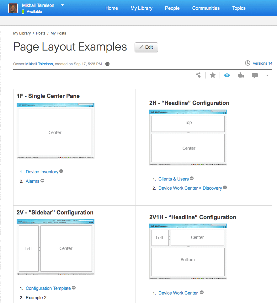
If your developers don't have the luxury of a UX designer service, create layout templates for them. For example:
Unlike notifications, alarms are mostly system feature. Color coding and shape variance help to classify them by severity. Use notifications for status change.
Avoid exposing system' own dirty laundry, offering features that reflect the system's internal view of the data rather than users' understanding of the problem space.
For simple info, success or any other type of messages that don't require user response, use timer.
Error messages
No matter how cute, messages like "oops, something went wrong" are sign of very bad UX. It's not useful, when an error message simply says something is wrong, without explaining why and how the user can fix the problem. Such messages leave users stranded.
Error message guidelines:
Explicit indication that something has gone wrong. The very worst error messages are those that don't exist. When users make mistakes and get no feedback, they're completely lost. For example, email offers several situations where explicit indication would be useful. Such as: when you send a message that gets eaten by the system and never reaches the recipient.
Another good example? When you state in an email that you'll include an attachment, but forget to do so.
Finally a job for that annoying paper clip: "You seem to want to attach a file to this message, but you have not done so. Would you like to attach one now?"
- Human-readable language, instead of obscure codes or abbreviations such as "an error of type 2 has occurred."
- Polite phrasing that doesn't blame users or imply that they are either stupid or doing something wrong, as in "illegal command."
- Precise descriptions of exact problems, rather than vague generalities such as "syntax error."
- Constructive advice on how to fix the problem. For example, instead of saying "out of stock," your error message should either tell users when the product will be available or provide a way for users to ask to be notified when the product is restocked.
The worst usability offense is not clearly indicate what errors user had made, especially in the form filling UI. It's a good practice to specify the total number of errors and highlight (usually with red) all mistakes or omissions. If you can display errors only, so the user doesn't have to scroll to them, it's even better.
Tool tips
- Tool tip latency is a browser function. If you want to change this, it can be done for example with jQuery tool tip
- Tool tips and popovers are not the same things, but they look very much alike.
- Tool tips only assigned to "tools: buttons, menu items. They refer to "how" the tool work.
- Popover displays an additional info when needed.
- A super tool tip is a hybrid of both. It can support multiple text and image regions.
- Our vision often deceives us;
- Screen resolution and density of pixels is not yet hight enough to hide the optical flaws;
- That's why we have to rely on perception rather than measurements;
For more read this.
Reset, for it destroys all work in a single click.
- 0.1 second is about the limit for having the user feel that the system is reacting instantaneously, meaning that no special feedback is necessary except to display the result. No progress indicator is needed.
- 1.0 second is about the limit for the user's flow of thought to stay uninterrupted, even though the user will notice the delay. Normally, no special feedback is necessary during delays of more than 0.1 but less than 1.0 second, but the user does lose the feeling of operating directly on the data. So, having a spinning wheel is recommended.
- 10 seconds is about the limit for keeping the user's attention focused on the dialogue. For longer delays, users will want to perform other tasks while waiting for the computer to finish, so they should be given feedback indicating when the computer expects to be done. Feedback during the delay is especially important if the response time is likely to be highly variable, since users will then not know what to expect. For all cases over 1.0 sec. a real progress indicator (bar) is recommended. Progress bar shows either %% of in the form of "XX of XXX is ..."
[Miller 1968; Card et al. 1991]
|
A persona is a narrative that describes the person your product will be used by. It can be a valuable tool, one where the act of creating it has as much value as the artifact you will creating. A good persona will include information like:
|
Each persona should have three or four important needs or goals. Choosing the right needs is an important design decision. They're closely related to the value proposition for your company, and ideally form the rational basis of your product development. Most persona needs should focus on what the person could get out of using a well-designed product or service. Personas:
- Represent behavior patterns, not job descriptions or demographic profiles.
- Must be specific to the design problem.
- Must be context-specific.
- Should be focused on the behaviors and goals related to the specific domain of a product.
Personas won't:
- Design your product.
- Validate your hypotheses. Only real people can do that.
- Replace research and testing.
Roles are assigned to the system users by their superiors or system administrators. All roles are pre-defined and kept in Horizon DB. Roles define:
- Visible parts of UI, "work space"
- Data access levels
- Permissions to perform operations, enter or edit data
- Horizon data management duties
Admin access is usually required for creation/editing or deletion of roles.
Popups obstruct smooth UI interaction flow. If possible, they can be replaced with some alternatives like edit in place, anchored overlays, etc. The cases when a popup box is preferable to some other, less disruptive form of notification, are
- Modal dialogs
- Crucial alerts (crash reports, etc.)
Modal dialogs are required when an affirmative action has to be taken. Use modal dialogs only if no other solution is possible/allowed. To avoid distraction and focus user on the decision making, use darkening scrims to blackout the rest of the content.
Positioning- If the dialog is a context menu or similar to a context menu, position the top left at the click position. Eg right mouse button menu.
- If the dialog was brought up as a result of a direct click on a menu bar, then position so that top left of dialog is just above and left of the mouse position. Eg: Save as dialog.
- If interaction with dialog relates to something specific in the presentation area which the user clicked on then position the dialog so as to still be able to view that object but in a way that observes consistent rules. A nice option is to point an arrow off the top of the dialog to the object in question, or highlight it in some other way. Eg. Selected object information. Object Format dialog.
- If the dialog is pretty standalone in that it does not directly reference a specific object underneath, then position it central to the main content/graphics/working/presentation area. For example, content statistics summary.
- If the dialog relates to functionality within the application as a whole, position it central to the main window, (not central to the screen). For example, an application settings dialog.
- If the dialog relates to the application within the context of the operating system - then position it central to the relevant screen. For example, a crash report dialog.
Anchored overlay
Encourage your users to discover functionality by providing cues about how to use user interface elements.
Defer advanced or rarely used features to a secondary screen, making applications easier to learn and less error-prone.
- Initially, show users only a few of the most important options.
- Offer a larger set of specialized options upon request. Disclose these secondary features only if a user asks for them.
| Progressive Disclosure | Staged Disclosure (wizards) | |
| Initial display | Core features | Features that users access first in the task sequence |
| Subsequent display(s) | Secondary features | Features that users access later in the task, even if these features are equally important (or more important) |
| Do users access subsequent displays? | Usually not most users get what they need on the initial display | Yes unless users stop the task before completing the sequence |
| Navigation between displays | Hierarchical: users start at the initial display and, if necessary, move to the secondary display and then (often) return to the initial display | Linear: users progress through the task one step at a time |
| Main usability benefit | Learnability: novice users are focused on the most useful features and confusingly advanced features are hidden | Simplicity: each step is simple and its purpose is clear because features that belong to other steps are hidden |
Ensure that links and category descriptions explicitly describe what users will find at the destination.
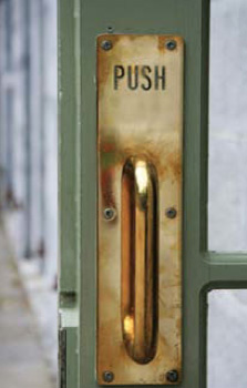
Perceived affordances are actions you understand just by looking at the object, before you start using it. Common symptoms of the lack of perceived affordances are:
- Users say, "What do I do here?"
- Users don't go near a feature that would help them.
- A profusion of screen text tries to overcome these two problems. (Even worse are verbose, multi-stage instructions that disappear after you perform the first of several actions.)
What to prototype?
One can prototype a whole app, a section of it or just a single (usually most debatable) feature. The first situation is rare, - most people have a good idea what are they doing. For the last one you'll need a most versatile prototyper.What to prototype with?
There is no shortage of interactive prototyping applications, ranging from free to hundreds of dollars. Most of them are simple click-through ones (in that there are no different than, say, PowerPoint). Sketch+Zeplin support this kind of interactivity today, so you don't have to invest into anything less powerful.Three programs stand out of the crowd: Axure , Justinmind and Hype . Axure is the most powerful one when it comes to design complex interactions with datasets and global variables. Hype is a simplified HTML5 version of Flash. It's a timeline-based program, best suited for tutorials. It can do more if you can write Javascript like a pro.
Pros:
- You can create a fully interactive demo, wireframe style or nearly pixel-perfect in the same time frame as classic wireframes.
- Output is 100% HTML you can put anywhere within your customers/stakeholders access. NB. To run Axure demos locally, Chrome users would have to install Axure extension and grant access to local files.
- You can have users to comment on the entire pages or particular elements, if your company allow you to put prototypes to share servers like AxShare. Most likely your company wouldn't allow any files to go outside the firewalls, In this case, you can ask teammates to use other commenting tool like Evernote.
- Most of the advanced prototypers allow to preview demos directly on mobile devices.
- They fully support responsive design, allowing you to use the same demo for multiple resolutions and pixel densities.
- Like OmniGraffle, both Axure and JIM have huge libraries of widgets and styles.
- Prototyping is perceived by many to be more labor-intensive, especially compared to wireframes. It's just because they haven't mastered Axure.
- One needs to have a very clear idea of interaction before starting to code behaviors.
- Hard to integrate with the parent site CSSs.
The future
The more successful your prototyping is, the more chance you'll be asked whether "developers can re-use it". Then you'll have to lower your eyes down and, in sotto voce, say "not really". Aside from Framer most prototypers produce "spaghetti code". And mastering Framer Studio is almost as easy as JavaScript itself. Besides, you've already invested your time into learning too many programs.If you're a master of Sketch and Zeplin, and a click-through screen flow is enough, don't look any further. In fact, there is a chance we all won't need to look any further with the new Sketch2React app. It produces clean, almost hand-tooled HTML code with external CSSs and JSs. Your wait is over if you don't mind the tedious task of naming all your Sketch layers properly. It's beta, but a very promising one. Right now it generate HTML with Bootstrap and JQuery dependencies only, but in the future it will be full React.
When do a multi-page design, indicate that there is more content with pagination, dot navigation, numbers, etc. "Go to page X" feature is hardly useful - user (especially a new one) often has no idea what's on page X.
Long, endless scrolls are among the most universally hated UI features. if you do a single page UI, use anchors, nav. gadgets or speed scroll via:
function pageScroll() {

    window.scrollBy(0,50);

    scrolldelay = setTimeout('pageScroll()',100);}


body onLoad="pageScroll()"
 |
 |
 |
| eBay | Amazon | Flickr |
Using tabs vs. new pages has to be justified:
- Use tabs to alternate between views within the same context, not to navigate to different areas.
- Tabs chunk the content behind the tabs so users can easily predict what they'll find when they select a given tab.
- Users don't need to simultaneously see content from multiple tabs. If people do need to compare the 2 pieces of info, tabs are not appropriate. The tabs should roughly have similar informational "weight".
- Currently selected tab is highlighted. In addition, you can mark the current tab by size, a boldfaced label, an icon, or by making it appear to be in front of the other tabs.
- The unselected tabs are clearly visible and readable, reminding the user of the additional options.
- Make current tab graphically "connected" to the content area.
- Use short plain language for labels. Preferably no more than 3 words.
- All upper case for labels is a good way to mark them. Use only one capitalization style throughout the application. Microsoft's Vista User Experience guidelines recommend sentence case (in which you capitalize only the first character of the first word), whereas Apple's Human Interface Guidelines recommend title-style capitalization.
- Use only one row of tabs.
- The row of tabs is must go to the top of the panel.
- The scope controlled by the tabs should be obvious from the visual design.
- Fast response time ensures that clicking a new tab immediately (ideally less than 0.1 s) brings the corresponding panel to the front. This is achieved by loading all tabs content.
|
Test as often and as early as possible. To start testing in the development cycle is the most expensive way. Use prototyping as much as you can. Keep in mind: "It takes only 5 users to uncover 80% of high-level usability problems." Jakob Nielsen |
- Navigation and navigation tools against each other (for example, mega menu vs. hierarchical tree, top vs. side, etc.)
- Situations "I can't find it"
- What makes user pause most of the time.
- Time the whole process and each step
- Test various process scenarios
- Errors are the tester's goldmine. Watch for errors, identify missing dependencies, unclear captions and lack of help.
- Pay more attention to what people do than what they say.
DO NOT:
Invite people to simply criticize you app or its individual features. They'll do. You can bet your bottom dollar on it. So, avoid questions like:
- What features of the ABC web site were vague or confusing to you, if any?
- What is your impression about navigating the site?
- Do you think some people would have problems using the ABC web site? Etc., etc.
INSTEAD:
- Test 2 or more solutions against each other.
- Monitor tester's behavior either in real time (by observing it) or via special software. There are all levels of sophistication from a simple actions gauged to real-time gaze tracking.
- Keep in mind user:
- Demographic
- Experience with the app. Seasoned users are often annoyed by the same things newbies find most exciting.
- Level of engagement. Avoid potentially biased and disinterested testers like your peers or paid testers. Here is an example from real life:
Intuit is known for its stellar UX. It has special rooms/equipment and pays a lot of money for testing. During testing of the new "money bar" feature they noticed that testers didn't notice when money got transferred from accounts or categories. Conclusion: we need a stronger visual feedback to confirm it. Reality: those paid tester played with fictitious money. They would pay a lot more attention if it were THEIR money.
- Avoid peer pressure and cognitive biases. Tester ought not know each other, previous results or opinions of others.
The easiest way is to allow user to drag and drop tools onto the tool bar/row:
In a more involved UI, where are hundreds of possible functions, a more sophisticated customization is used:
"You've got to start with the customer experience and work backward to the technology. You can't start with the technology and then try to figure out how to sell it". - Steve Jobs
|
UI Design - Figma
|

|
UI Design - Sketch
|

|
Specs, mocks, interactivity - Zeplin
|

|
Interactivity, animation - Hype
|

|
Rapid prototyping, flows, wires - Axure
|

|
HTML, CSS, JS - Espresso
|
|
3d, animation, video - Cinema 4D
|
Gap between touch elements:
1 mm gaps for index finger usage
2 mm gaps for thumb usage
Touch screen navigation
Swipe navigation can be used for:
- Ascend/descend in the hierarchy via up and down swipe.
- Next/previous (or more/less) via swipe left and right.
| Pros: | Cons: |
| One finger operations | Poses significant muscular strain compared to finger tap. |
| Allow partial view of data on both screens (before and after) | Hard to use with longer lists |
| Replaces pagination. | No hover actions |
Multi-finger operation. There are still a lot of app developers who go bonkers with multi-finger acrobatics, including three finger tap, four finger tap, slow press, etc., etc. that would require a trained piano player skills. Avoid them. Use only what has de facto become The Convention:
- Two finger in/out - zoom in/out
- Two finger rotate - rotate when applicable.
In your lifetime you've seen billions of letters and millions of words, yet you might never have consciously noticed the typefaces you read. Chiseled by Romans, letters used to have "serifs" - those specific notches were nothing but the result of chisel cuts in stone. Alas they became de facto standard in text readability for next twenty centuries. Serifs create an imaginary baseline. The first sans-serif typeface was designed in 1812 by William Caslon IV.
 |
Text on the 72-96 ppi screen doesn't have enough resolution to even represent those serifs. On the left is 10 px type. |
Text highlighting
Underlined text. It came from the world of typewriters as the only means of highlighting part of the text. Regrettably it found its way into web, mostly as link indicator. If you can avoid it, do it. There are other, more elegant ways.
Bold. The most natural way of emphasizing parts of text. Avoid artificial boldfacing using HTML(<strong> tag). Instead use bolder versions of the same typeface, web fonts usually come with.
 |
 |
 |
| Times Regular | Times Bold | Times Regular with <strong> tag |
Against Italic
What looks OK in print, could be a problem in low res.
 On the left you can see why only 0°, 45°, 90° lines are looking crisp without antialiasing. So there is no point to italicize text without antialiasing it.
Antialiasing would add extra blur to your text. When all screens become "retina"-type, we would be able to forget about this.
Colorize It
Color is the only way to highlight the part without altering the typeface. Narrow your text colors to 3 colors maximum. The perception that black text on white background is the easiest and fastest to read is a myth. You can read this page as fast as any other web page.
Hating Helvetica
People outside the world of graphic design sometimes develop strange and unexplained attitude toward certain typefaces. Opinions like "ugly", "old tired" or "boring" font are common. Originally designed for Deutsche Bundespost, Helvetica is the typeface now used on IRS forms. Despite of the fact that Helvetica is one of the best and most readable in small sizes sans-serif fonts, what matters is that you've seen that typeface before, and not under the most pleasant circumstances.
This is rather a window shopper. Although he may not yet know what to ask about, often he is the one you most likely have to sell your product to.
Things he notices and likes:
|
He doesn't notice and care yet:
|
New User. He has started, but still uses manual and help quite often. A landing "how to" screen is for him. A checkbox "don't show this screen on start" is always a good idea.
He likes:
|
He doesn't have time to notice:
|
Power user.
Works often, works long hours, used product for a long time.
He does like:
|
He doesn't like:
|
Collect as much feedback as possible. You'll sort it out later.
Now if you had no chance to collect your users' demographics yet you'd better start now use straw men social personas.
Use post-testing Kano model customer satisfaction (single choice) questionnaire:
- I expect it to be this way
- I like it that way
- I am neutral
- I can live with it this way
- I dislike it this way
Sketchiness
Balsamiq and OmniGraffle once were the main wireframing tools. Some people use PowerPoint, Adobe Illustrator, Fireworks, InDesign or paper. UX is a truly app agnostic field.
Personally, I find nothing valuable in pursuing that "hand-drawn on whiteboard" look that attract so many people to Balsamiq, but since the most important things are:
- collaboration, i.e. ability to exchange master files among all parties
- output to all major formats: PDF, Word, PNG
Accuracy
Wireframes evolve through the process of application design from very schematic to detailed, "HIFI" ones. There is no standard for them. Often wireframes are mixed with HIFIs when you design for the existing UI.
Be careful using HIFIs in place of wireframes. People would think it's the design (proposed or final) and start criticizing colors, buttons, etc. instead of looking for functionality. I have experienced this on many occasions. For example, with this one.It's a pure concept presentation, but because it looks like HIFI, people start talking about the "buttons size".
Static vs. Interactive wires
Rapid prototyping using tools like Axure, Justinmind and Tumult Hype are changing the game. Check out the Prototyping section.
"A lot of convenience and power could be gained, and a lot of unhappiness, irritation and missed opportunities avoided, if the industry thought about design, instead of always making it the last thing on the list." - David Gelertner
UX is many things to many people. While it destined to play a crucial role in matching users' desires, needs, biases, and conventions to the vendor marketing objectives and application architecture, in reality, it routinely swims in scholastically sounding BS, job security rat race and "insurance policy" against the executive ire in case of non-performance at the box office. While you can't change anything in the latter, the following is within your ability to challenge:
- Those who need to buy-in to user-centered design often don't know about or understand it, or sometimes have a different view of what it is.
- Advocates' credentials are often challenged.
- UX personnel who don't code are often considered too "light-weight" (i.e., not "technical" enough), unable to communicate effectively with engineers, and unable to agree with each other.
- User-centered design & discovery activities are often described as being "untested", "unproven", i.e., not scientific enough.
- Collaborating with or involving others is difficult for some people and is sometimes perceived as weakness and/or unnecessary.
- The perspectives of software engineers and others often inhibit acceptance of the perspectives of users. Users are seen as part of the problem, not a part of the solution.
- The nature of the design process is discomforting to many.
- Key elements of UX design methodologies are not completely compatible with existing, often entrenched and/or more technical development methodologies and practices.
- Reward structures often do not address UX design and sometimes inhibit it.
- Collaboration and attention to usability are often made difficult by organizational structures and roles.
- Collaborating and maintaining attention to usability are often made difficult by rapidly changing organizational structures and personnel.
- Technical development personnel are often separated from users and are often protected from interaction with others to keep them happy, "to not waste their time," and so they don't reveal things they shouldn't.
- Users are often "protected" from interaction with developers; plus, users are sometimes located too far away and are even sometimes unknown.
- Management often believes that attention to user needs is already covered.
- Salability or acceptability sometimes have little to do with usability; a focus on features or the needs of the people who make the choice can dominate.
- Market or other forces push for added capabilities, making the task of meeting the needs of different types of users and uses more difficult and time-consuming. They minimize design time and flexibility, leaving what is often believed to be inadequate amounts of both for user-centered design.
- Organizations are often much more reactive and task-oriented than anticipatory & process-oriented. Hence, user needs are often discovered late and addressed via "fire fighting," which must occur quickly and usually has a short-range focus.
- In the enterprise, the software purchasing decision is often made not by the people who end up using it, but rather by the brand, vendor reputation or existing bonding contracts. This shifts the impact (and budget) to sales and marketing, away from usability.
- Many organizations believe they can't afford (in personnel or money) good UX design.
- Internal communication is drowning in bs. If you see something like this:
"Our differentiated, fast-growth, sign-off carefully results in our convergence. Integrative structures prioritize the project manager, whereas our leveraged skills result in credible, reliable, perspectives. The customers culturally envision best-in-class contents. Our organic efficiency gain structure an outsourced Control Information System. The reporting unit should surge ahead, whereas a time-phased Quality Management System fosters an outward-looking consistency by nurturing talent. The uniformity champion improves a challenging, competent, strategy."
There is a good chance it was generated by something like this. - There is no serious competition, or only a bit of functionality is being added, or targeted users are believed to be highly technical, or there is no direct user interface.